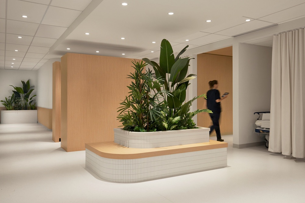
Espace 313 presents its modern reinvention of a surgical center located in Westmount Square, a building designed by Mies van der Rohe in the 1960s in Montreal, Canada. With a focus on maximizing natural light and utilizing soft, natural materials, the project revolves around the human experience and well-being.
For many years, hospitals and medical clinics were designed and built for maximum efficiency, often neglecting the human and aesthetic factors of the environment. It was not until the 1990s, following numerous studies demonstrating the impacts of the environment on patient behavior, that aesthetic considerations in the healthcare environments became a real concern for design professionals.
Interior design firm Espace 313 was mandated to completely restructure and renovate the premises of an 8,000 sq. ft. private surgical clinic located in downtown Montreal. The studio approached the brief with one primary concern: how to move away from the cold, sterile atmosphere so often associated with hospital environments?

Light as a conductor
Placing the human factor at the heart of its creative process, the firm’s design proposal puts forward functional and aesthetic choices aimed at positively influencing the behavior of both patients and staff. The layout of the space was initially designed to take advantage of the abundant natural light available in the space. As a result, most of the rooms are not dependent on artificial lighting for daytime illumination, and numerous glazed partitions were installed with the aim of diffusing as much natural light as possible into the heart of the building. In areas where this wasn’t possible, the rooms are lit with soft, warm light, a deliberate choice in stark contrast to the cold, sterile lighting often found in healthcare environments.

The user at the center of the creative process
Using notions from environmental psychology to determine the characteristics of each element of the space, the designers aimed to create a unique experience that would help visitors and patients to better manage stress associated with a major medical procedure. As a starting point, the designers used the principle of connection to nature for developing the rest of the concept.
“There was a strong desire to push ideas beyond what we’ve seen in healthcare design in recent years, with the goal of making patients feel immediately comfortable,” said Gatline Artis, owner of Espace 313. “This was achieved with the use of a soft, earthy color palette, curved volumes, and natural materials that echo a residential aesthetic. Vegetation also plays an important role, as it creates a connection to the outdoors and nature, which are well known to induce a sense of relaxation in users.”

Inspired by the human body
The spaces in the administrative area, including the reception, consultation rooms, and offices, are directly inspired by the aesthetics and softness of the human body, both in its curves, colors, and textures, and in its imperfections.
This includes the use of faux plaster wall finishes, made by a local artisan, which brings a soft, fragile, and imperfect visual quality, juxtaposed with terracotta brick walls that contrast in color, porosity, and material hardness. The use of furniture with organic lines, and the omnipresence of sober, natural-looking textiles, also contrasts with other cooler elements, such as the champagne-colored metal reception desk.
One of the main challenges of the project was to carry the aesthetics of the administrative area through the consultation rooms and pre- and post-operative areas. These spaces require specialized materials and equipment that rarely match the sophisticated aesthetics sought here. The Espace 313 team undertook extensive research to reduce the differences in mood and ambience between these areas in order to achieve a consistent atmosphere throughout the space. That endeavor is reflected in the use of high-performance materials, but with a residential feel: wood-effect finishes, imitation linen fabrics, artificial vegetation, and much more.

Attention to detail extends to the sanitary facilities, where no aesthetic aspect has been overlooked. Materials and lighting have been carefully selected to ensure that patients feel comfortable and at ease at every moment of their stay.
With this conceptual proposal, Espace 313 takes a fresh new look at hospital design and offers a unique vision of the medical clinic of tomorrow, where aesthetics and warmth coexist with health and the hospital environment.

Other images can be seen in the gallery down below
Project: Westmount Square Surgical Center
Location: Westmount, QC, Canada
Studio: Espace 313
Designers team: Debby Pagé, Gatline Artis & Kelian Vallier
Suppliers: Slik Design, Decor Veronneau, Ramacieri Soligo, Studio Bottè, Bludot, Gauley Brothers, Distrimar, Artopex, Cime, AND Light, Jacques & Anna
Area: 7850 sq.ft.
Year: 2022
Photographer: Maxime Brouillet
Awards: Gold certification at the Grands Prix du Design - 16th edition
About Espace 313
Founded in 2015 in Montreal, Espace 313 embodies the innovative spirit of Canadian commercial interior design. This collective of young, talented, and passionate designers stands out by creating impactful, unique, and highly functional spaces.
Driven by the deep conviction that every brand is unique and that no experience should be the same, the Espace 313 team constantly strives to create identity-driven spaces that tell a story, evoke emotions, and reflect their clients' values through bold designs. Working with a human and collaborative approach, combined with meticulous attention to detail and an unrelenting quest for innovation, these designers create iconic immersive experiences throughout Canada.
Recognized multiple times, the tight-knit team of Espace 313 is composed of a mosaic of talents dedicated to excellence and determined to continually push the boundaries of commercial interior design.

