

What was the inspiration behind the design concept for Farmácia São João?
The concept did not begin with an image or a formal reference, it began with a problem. The plot sits at a corner between two streets with opposing urban characters: one an expansion avenue with multi-family buildings and commercial activity, the other a residential road with a slower, more domestic scale.
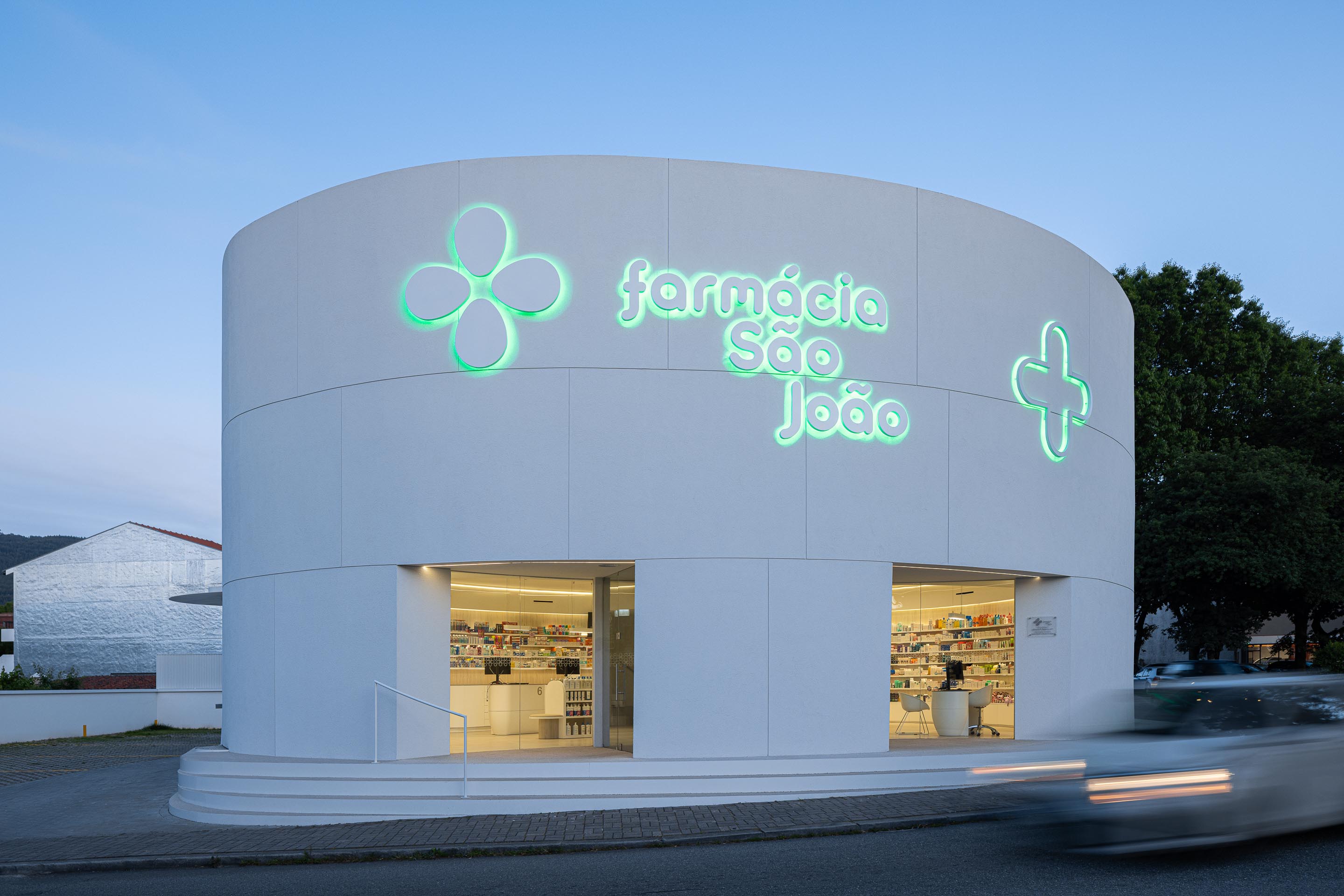
The response was a monolithic white volume, excavated from within. The exterior reads as a single, continuous mass reinforced by the stereotonomy of the façade panels, which follow the curve without interruption and suppress any reading of joints or layers. Inside, the character shifts: timber elements and living vegetation introduce a biophilic quality that contrasts with the solidity of the enclosure. The building is closed to the street and open to itself.
The curved façade serves as a distinctive feature of Farmácia São João. Could you elaborate on the reasons behind the decision to incorporate curved forms?
The form was not chosen for its appearance, it was derived from its conditions. The building needed to maintain the height line of the surrounding context, and within that constraint, the curved volume acts as a pivot: a hinge element that articulates the different spaces and streets around it, the way a rotula connects two joints.
A rectilinear building would have had to choose one street as its front. The continuous curve addresses both simultaneously, at the same scale and with the same presence.
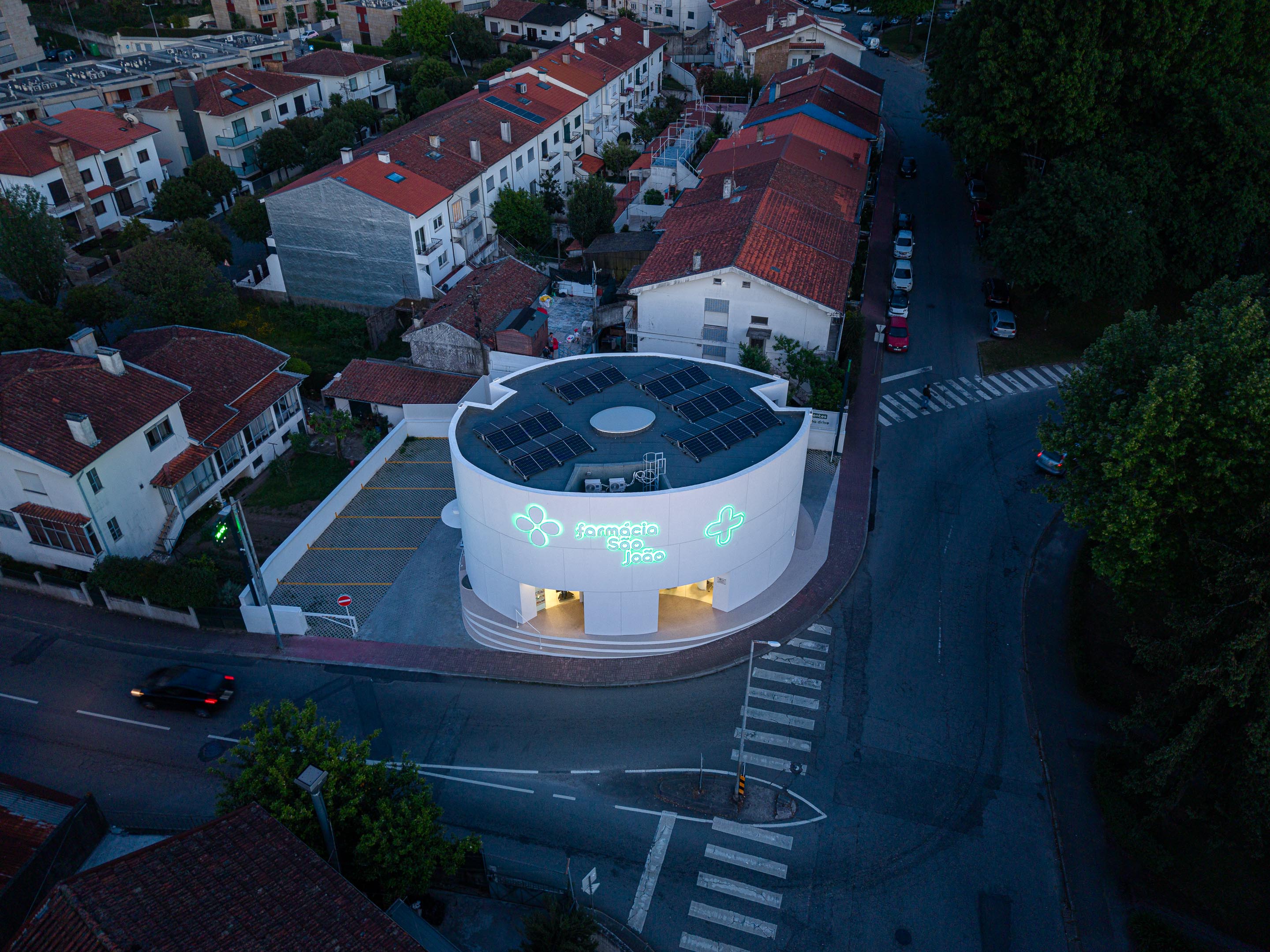
There is also a programmatic reason: the brief included a Farmadrive, a drive-through dispensing service. The curved perimeter allows the car to circulate around the building without obstruction or tight turns.
The form resolves three problems at once: the urban corner, the drive-through circuit, and the transition between two contrasting residential scales.
Could you share the background behind the spatial planning concept?
The programme was distributed across three levels: a public-facing ground floor, a technical and administrative first floor, and a storage basement. The priority was to keep the ground floor entirely clear for service — no back-of-house functions, no visual obstruction between the entrance and the counters.
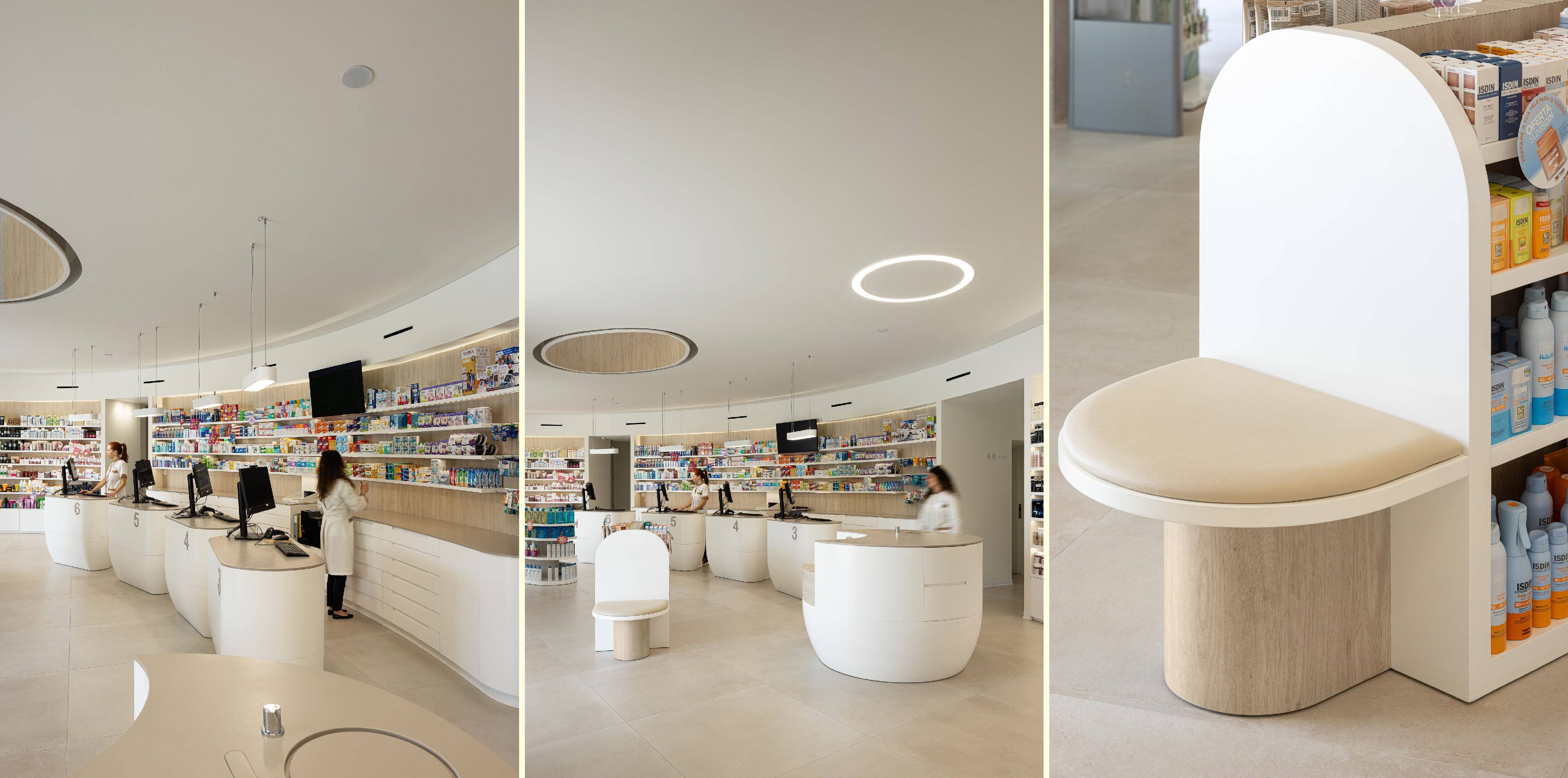
The counters follow the curvature of the perimeter, which means the interior geometry is consistent from the outside in. The oval is not a shell applied to a rectangular interior, it organises everything: the plan of each floor, the position of the counters, the circulation, and the placement of the skylight.
READ ALSO: Farmácia São João: A Sculptural White Volume Defining a Street Corner in Braga
An oval skylight penetrates the ceiling plane, creating a vertical connection between the two floors. What were the key considerations behind this decision?
A building with a continuous curved exterior and no corners runs the risk of becoming introverted, turning away from the city to protect itself. The skylight was the way to open it vertically instead of horizontally.
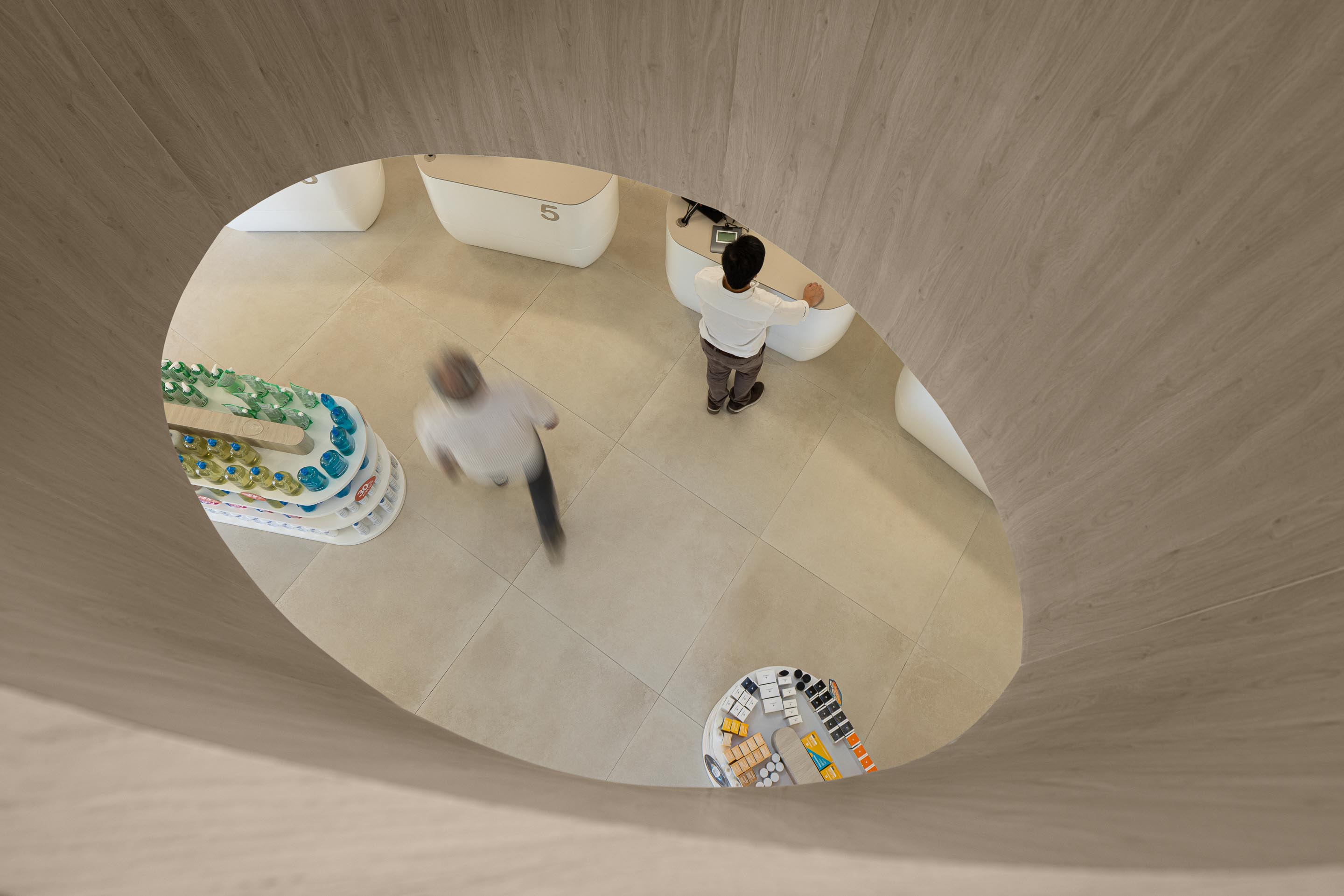
The oval opening cuts through the first floor slab and brings daylight directly into the heart of the ground floor service area. At the same time, it creates a visual connection between the two levels – someone working upstairs can look down into the dispensing floor, and someone waiting at the counter can look up through the opening to the sky. It gives the building depth without breaking its compact exterior reading.
As dusk falls, the illuminated green signage transforms the building into a distinctive landmark. What were the key considerations behind the choice of green signage?
Green is the universal language of pharmacy in Portugal and across most of Europe. Our role was not to reinvent that convention but to integrate it with the architecture. The graphic design of the signage was developed in close articulation with the building itself: Both elements share the same language, floating discreetly above the façade.
At night, the internal illumination activates them, and the building shifts register: from a quiet white volume to a legible landmark.
Project name: Farmácia São João
Client / Developer: Moura e Taveira, Lda.
Architecture Office: Tsou Arquitectos
Main Architect: Tiago Tsou
Architectural Photographer: Ivo Tavares Studio
Location: Lote 24/25, gaveto da Av. Robert Smith com a Rua Simões de Almeida, Fraião, Braga, Portugal
Year of conclusion: 2026
Total area: 306 m² retail/services + 163 m² technical/storage basement
Builder: Vasco Fernandes – Construção e Engenharia
 English
  Indonesian